
Here is our first draft of our website for the
digipak. I created this in
Dreamweaver and used past knowledge to come up with this. Showing it to the group we decided that it was good and
elements of it could be used but overall it was too messy. This lead to us
de-cluttering the website to make it sleeker and look more professional. A starting point would be to take the images away from the sides. This is because a website does not have to have a strong link with
a music video but should reference to it as well as a
digipak.

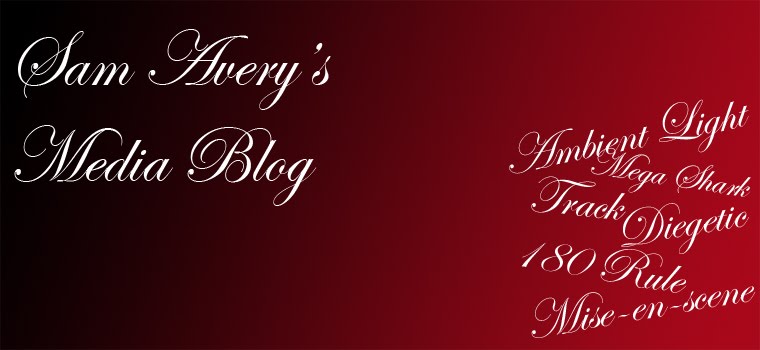
Here was our second draft of the website. You can clearly see a strong hint of our first draft with the same colours and layout being used. The fonts were changed and size of some of the parts of the website have been changed. Overall a large improvement has been made as the website looks professional due to its minimalistic look and it also has a futuristic look to it with the colours. This fits the band well with their
electronica music.
 Here is our first draft of our website for the digipak. I created this in Dreamweaver and used past knowledge to come up with this. Showing it to the group we decided that it was good and elements of it could be used but overall it was too messy. This lead to us de-cluttering the website to make it sleeker and look more professional. A starting point would be to take the images away from the sides. This is because a website does not have to have a strong link with a music video but should reference to it as well as a digipak.
 Here was our second draft of the website. You can clearly see a strong hint of our first draft with the same colours and layout being used. The fonts were changed and size of some of the parts of the website have been changed. Overall a large improvement has been made as the website looks professional due to its minimalistic look and it also has a futuristic look to it with the colours. This fits the band well with their electronica music.

No comments:
Post a Comment