Delphic - Doubt

Sunday 28 February 2010

Website Development

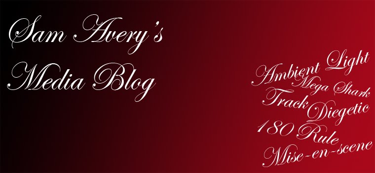
Here is our first draft of our website for the digipak. I created this in Dreamweaver and used past knowledge to come up with this. Showing it to the group we decided that it was good and elements of it could be used but overall it was too messy. This lead to us de-cluttering the website to make it sleeker and look more professional. A starting point would be to take the images away from the sides. This is because a website does not have to have a strong link with a music video but should reference to it as well as a digipak.
Here was our second draft of the website. You can clearly see a strong hint of our first draft with the same colours and layout being used. The fonts were changed and size of some of the parts of the website have been changed. Overall a large improvement has been made as the website looks professional due to its minimalistic look and it also has a futuristic look to it with the colours. This fits the band well with their electronica music.

Friday 26 February 2010

Teacher Feedback

After editing our footage to the end of the first chorus we approached our teacher for feedback on what we had. This would give a good sense of how we were doing and needed to go. Unfortunately she did not like the majority of our footage. There were several reasons for this such as lighting and framing. A big problem she picked up was our main character. She did not like him miming and did not believe it was convincing. She was also not convinced by our party scenes believing they were filmed badly and looked like a night over a friends house opposed to a party.

This created a problem for our group. Giving us certain things to consider and other problems to overcome. The best example of this is replacing our verses of our main character singing.

After a long period of meetings we decided the easiest way to get around the verses would be to scrap all previous footage and ideas we had and base it much more on the narrative of the video. This would mean focusing on the story of our main character being a closet homosexual and the revealing of this. This would be focused on much more there for and the party would be a reference point to flash back to the "night before." This meant scraping all miming scenes we had although keeping our main character the same.

For our next shoot we have rethought our idea and have an understand of what we have to film for our song. The first verse will be of our main character waking up and realising what he has done by seeing clothes, alcohol bottles and a condom wrapper on the floor. This will cause our main character discomfort. The second chorus will consist of our character in the bath room trying to remember the previous night and washing himself (in the shower and washing in the sink) this will symbolise him trying to cleanse himself of his mistakes. The final voice will be of our main character back in the party scene and then becoming overwhelmed and running away from the party. Our choruses will still consist of our main character singing with a younger version of him and the revealing of our other character being a man shall still be our ending.

Monday 22 February 2010

Digipak Development


Above are images of how we have produced the rest of our digipak. It is clear to see a theme throughout the digipak with the colours and the glow on all the text. We like this digipak as it has a futuristic feel to it and very simple. However, we do not feel it is strong enough to be a digipak and will be hard to design inside panels for it. This is because it will be hard to create something different to the Spirograph and still fit with the existing digipak.

Sunday 21 February 2010

Saturday 20 February 2010

Editing

With our first filming shoot complete we can now begin to edit our footage. This will help us see which footage is usable and which is not as good as we believed. This will help us plan for our next film shoot and will also help us choose a filming style we like and wish to continue using.
Below you can see a screen shot of some of the footage we have edited. The first picture is of our intro. This is a fast part of the song and the editing reflects this. We like the footage we got for this as the strobe light works well and the quick cuts and simplicity of the footage work well and fits what we wanted to achieve.

Here is a picture of some of our footage edited to make up the first verse of our song. Different shots were used throughout this part of the song whilst our character was miming. This helped us with continuity as we could match up the lyrics to the images to make sure it was in time and worked well. Whilst editing it became evident that some our footage was unusable and some stuff would have to be filmed again to get the quality we want.
Due to this we arranged another film shot to compensate for this.

Thursday 18 February 2010

Digipak, Draft Two


Here is a design for the back of our digipak. We are trying to continue the theme of the front panel by having the glow behind the text. We got the colour of the glow from the Spirograph on the front cover. We managed to keep a simplistic feel to the back cover by only having the glow and names of the songs that would be on the album.

The above images of our digipak are good. I believe they carry on the house style of the front cover and also support the simple theme we are trying to create. With having little information on the back I believe a user will enjoy the digipak as it was what the purpose of the back of a digipak has. I still believe it will be hard to create the remaining two panels of out digipak following this theme without it becoming boring.

Tuesday 16 February 2010

Digipak, First Draft


The image above is out first draft of our album artwork which will be the first page of our digipak. We had all, as a group, decided the front cover should be simple as looking through existing album covers a reoccurring theme was evident that a lot of album covers do not relate to the band.

Jack then had the idea to use a Spirograph image as the album cover. This is because he felt it had the potential to look futuristic and is very simple to create, although very hard to look professional. With the hope of it looking futuristic it will fit with the bands electronic music style and tie in the artist with the imagery.

We added effects to the original white drawing on a black background. This gave it a glow and an edge to just a flat drawing. The Spirograph itself looks 3D and stands away from the background. We decided to place the logo of the band in the center of the album artwork to be seen whilst remaining hidden until closer viewing.

Overall we feel positive about this first draft of our digipak. However, i believe it will be hard to create four panels for this digipak without it being boring and too simple that it loses its impact and people do not notice it amongst other digipaks in a record store.

Monday 15 February 2010

Filming Plan For Shoot 2

After reviewing the footage we had from the first filming shoot during our editing we decided we did not have enough to fill the whole song leaving gaps in our video. We had also decided some footage was better than other parts and some would need to be re-filmed. We had also planned to re-shoot some of the party scene but a lot of the people could not make it making us unable to film scenes from the party.

Due to this we made a list of clips we should film to fill the gaps and help build out narrative.

A homosexual kiss
Lights being switched on.
A spinning coin.
Rolling of dice.
Protagonist looking into a mirror.
Washing hands.
Shower scene.
Crying.
Biting of lip.
Rolling/ Smoking a cigarette.
Drinking Milk.
Scrunching hair.
Key in a door.
Biting an apple.
Close up of eye opening.

Although these seems seem to have no relation to a party they are all key to the narrative of a closet homosexual.

Thursday 11 February 2010

Digipak Ideas

Above is a quick mock of an album artwork we could work on. It has a strong theme from the music video as the two main characters are on the front. However, the images are not particularly good and it is not the style we want for our digipak.

Wednesday 10 February 2010